There are a lot of bad infographics out there. Some just don’t work with human perception and because of that, end up lying about the data. Others suffer from designers trying to do something “different”. But by far, one of the biggest problems is incomplete data. Data sources are one of the main reasons for this. When you’re dealing with large data sets, getting all the data is very expensive, either in terms of man hours to find, or financially, i.e. paying the company that did the surveys and research. In order to cut costs, infographic producers and clients do whatever they can to avoid paying for that data. This limits them to the data that is in the summary of the actual dataset, and whatever else they can scrounge from multiple other sources. The problem is, not having all the data means you don’t have the full story. This limits the visualizations you can use, and it puts extra stress on the whole process. The coherence of the infographic will suffer, and the story it tells may be incomplete, or even flat out wrong.
Incomplete data can also lead to some rather strange visualizations.
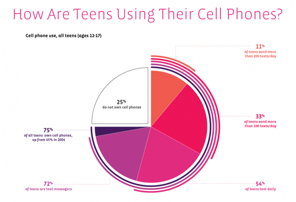
Designers are asked to make an image from data, and when they don’t have all the data, they have blanks to try to paper over. Here’s one example of a broken visualization where missing data is probably the main culprit.  Is this a double encoding of data? Sometimes double encoding is good because it reinforces a data dimension. In this case, however, it is not a double encoding. There are a few issues going on here, and the chart is just making them even more confusing. Is the data cumulative? The wrapped bar chart (which is bad for human perception to begin with) suggests that the data is cumulative because there is overlap between each category, but the pie chart indicates that each group is separate. If the data is cumulative, the bars could be interpreted as backwards. The 11% that send 200 texts/day are also part of the group that sends 100 texts/day, but the bar shows the inclusion in the opposite direction. At the same time, the 200 texts/day group is obviously more exclusive than the 100 texts/day group, and therefore would be smaller. Is there a part to whole relationship? The data that goes into pie charts absolutely needs to have a part to whole relationship to make the pie chart a valid visualization choice. Depending on how the data/visualization is interpreted, this may or may not be the case. What would be better? This type of data is probably best represented in a venn diagram, unfortunately the chart creators probably didn’t have enough data to represent all of the inclusion relationships, so they ended up with this monstrosity instead. The lesson to be learned from this is that having all the data is important. It may be expensive or time-consuming to get, but it will definitely change the quality of the final product that gets produced. Design can make something look pretty, but that is separate from the quality of the content. Don’t rely on designers to make up for inherent data problems. Drew Skau is a PhD Computer Science Visualization student at UNCC, with an undergraduate degree in Architecture.